
Our team chose Ratchet & Clank from a pool of games to break down its art style and analyze each component.
Inspiration

Ted Price (president and CEO of Insomniac Games) once said, "Brian Hastings, our chief creative officer, suggested we make a game about a spacefaring alien who has an outlandish arsenal of gadgets and weapons. He cited Marvin the Martian as inspiration."


"We drew from all sorts of sources. Cartoons, sci-fi movies, popular culture... There were certainly some direct playful references to other properties in both the initial concepts and in subsequent games. Captain Qwark was partially inspire by the Tick. Metropolis with its flying cars and city canyons is reminiscent of The Fifth Element. Courtney Gears from Up Your Arsenal was a riff on Britney Spears who was popular at the time. But these are exceptions rather than the rule. Most of what you see in the games is a direct result of our team just having fun in a universe with very few constraints.”
Environment


The environment of Ratchet & Clank is very rich and vibrant. Everything feels alive with color and animation. There are often flying vehicles in the background or rotating machinery, and of course animated plants. The environments are designed to feel much bigger than they really are by using atmospheric effects to create a sense of space, and by using animated background elements to create a sense that there is a lot more going on beyond the range of the player.
Shape Language

Shape language refers to the most basic shapes used in the design of characters in order to express their general personality traits. Ratchet is a headstrong go-getter type of character. As the main character he has a lot of softer rounded shapes, such as his oval shaped head. Ovals are the type of shapes we see in infants, and so we think of something friendly and innocent when we see ovals in characters. However Ratchet also has very large triangular ears. Angled shapes are used to convey a dynamic personality. They may suggest extroversion, mischief, or danger. When you mix an element like this in with the oval shapes, you get a character who seems friendly, outgoing, energetic, and either a troublemaker, or simple someone who finds trouble.

Clank's design is a direct contrast to Ratchet. His head and eyes are round, and his body is a rounded square. His features emanate that child-like sense using the oval shapes. His eyes are very large compared to the rest of his body which is a way of conveying infant-like trustworthiness to the audience. This works with his character as his is more level-headed and wise than Ratchet, often warning him against danger and offering advice.

The villains of the series follow the same principals. Captain Qwark is a narcissistic, arrogant character who is often shown to be foolish and cowardly despite his blustering and strength. His chest is one big triangle, but he has many soft rounded features to hint at his foolish side.

Dr. Nefarious is the perfect example of a supervillain. He has skinny arms and legs with lots of sharp angled pieces in his design. Spikes and angles convey danger and aggression, and his eyes are very small compared to the rest of his body. Small eyes convey the opposite of Clank's large infant-like eyes, and it lets us know that this character probably isn't trustworthy.
Lighting and Atmosphere

In most cases the environments are brightly lit with warm lights and a fair amount of fill or bounced light. The style is mostly realistic but with emphasis on warmth especially in the foreground to really pop things out.


They use volumetric lighting to create light shafts and to desaturate the background which creates a sense of great distance and open space. The desaturation and atmospheric fog also help to bring the foreground elements out.
Animation Style


The animation style is very cartoony with exaggerated character motions. The way each character moves is indicative of their personality. They relied heavily on blocky prototyping and strong shape design to make each character distinct in motion. Ratchet & Clank is well known for its very expressive facial animations. Characters use a lot of squash and stretch in their body and face to match the cartoony style.

Notice the differences between Ratchet and Clank in the way they move. When Clank gets up his body is more clunky and robotic. He stops to look back and forth with a very constrained hinge-like movement, although his hands still flop around. Ratchet moves differently. He sways and stumbles in a much more smooth organic way. His tail and ears have a lot of overlapping action which makes him feel more like an organic creature compared to Clank.
Iconography

The logo design compliments the theme of the game in its design. It uses copper and steel materials with brushed metal texture. The font is blocky and metallic. The dash on the A in Ratchet extends to meet the C forming a spanner. The ampersand in the name is embossed in a gear, which is connected with the gear-shaped C in Clank. Altogether, a strong sense of mechanical and sci-fi is evoked just from the logo and the name.

The UI icons are all enclosed in a holographic hexagonal background. The hexagon is reminiscent of a screw or bolt. The icons are all stylized, simple, and use shades of blue and white similar to blueprints.


The holographic hexagons are repeated throughout the UI in all the menus which creates a unifying theme. The menus all have clean, semitransparent lines designed to look like a futuristic computer screen.

The trophies in the game are depicted with a gear border, and
a silhouette drawn on a glowing background. Furthermore, they usually all have
tongue-in-cheek names. For instance, the above trophy is called Going Commando,
and is given to the player if they use only the wrench to kill ten elite
enemies.
Technical Considerations
They updated their rendering technology to use PBR (physically based rendering). Matching the in-game low-polygon models to the film's high-polygon models was a huge concern. Captain Qwark in-game had a polygon budget of around 20,000 polygons, while his film model had nearly 50,000.
Anti-aliasing was used to smooth over organic shapes, however straight lines and sub-pixel detail do not fair well. This can lead to pixel popping and shimmering.
Special Design Considerations
As a platformer/shooter, art style considerations for
Ratchet & Clank needed to wrestle with the dual task of ensuring the
enemies and environment were visually distinct while also ensuring the
environment was easy to navigate.
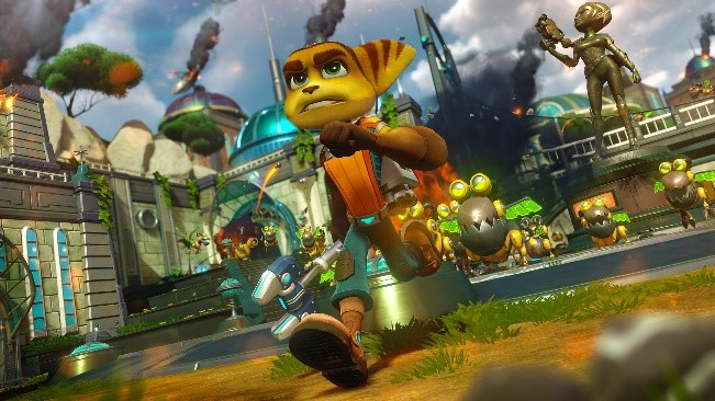
Both Ratchet and the enemies throughout the game have colors that contrast the environment so that they pop out. Both contain
yellow and orange traits which cause them to jump out against the green and
gray backdrops.

The environment is lush and contrast the main character’s
colors so he never gets lost on screen. The walls of buildings are a distinct
shade, with a greenish hue that blends them into the ground colors while still
keeping them distinct, likewise their cartoonish design allows them to pop out.
Moreover, these design choices also keep everything from clashing with the
little bit of UI on screen.


Even when the environment is not lush and green, it
never clashes with Ratchet’s design. Notice here how his costume is changed and
designed in such a way that it doesn’t blend into the red/yellow lava or
industrial machines. The blue glow on his equipment and back allow the player
to never lose track of him in the chaos of the game play.
No comments:
Post a Comment